

UX/UI | SLO N’ GO
An academic rebranding project focused on enhancing User Experience and User Interface.

SLO N' GO ✧
SLO N' GO ✧
Purpose
The goal is to rebrand the San Luis Obispo Facebook rideshare page into a user-friendly mobile app for easier access and convenience.
Timeline: April-June 2024
Team: Angela Shum, Malia McCaig, Han Nguyen, Andrea de la Vegat
Software: Figma/FigJam, Adobe Illustrator, Canva, Trello, Miro, Google Forms, Procreate.
Problem
The current SLO Ride Share Facebook page lacks effectiveness as a platform for connecting rideshare users in San Luis Obispo.
With minimal branding and no distinct identity, it appears similar to other Facebook groups, making it difficult for users to recognize and engage with the community. Users struggle with navigation and finding relevant rides due to the absence of category filters, resulting in inefficiencies when seeking specific posts or ride options. Accessibility is limited, as users must wait for invitation approvals before participating, and the reliance on Facebook, a platform with decreasing popularity among certain demographics, restricts the user base, leading to fewer participants and limited engagement overall.

Solution
SLO N’ GO is a ride share app designed to help users easily find and coordinate carpool options for various destinations and schedules. Aimed at students, the app combines a clean, user-friendly interface with essential tools to make finding or offering rides quick and straightforward.
Research
Identifying user pain points of Current Branding
The Why-Why Diagram systematically identifies the core pain points of the original rideshare interface, providing a structured understanding of issues that need resolution to improve user satisfaction. With these insights guiding the design process, we developed targeted features to directly address and resolve these challenges, creating a more effective and user-friendly platform.
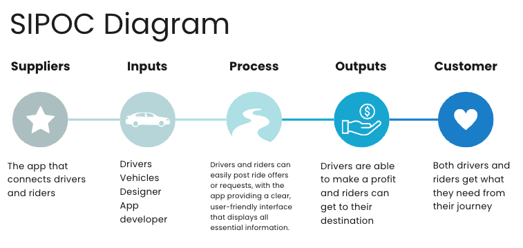
The SIPOC Diagram focuses on operational workflow goals, considering the critiques of the original page. It helps clarify how each component contributes to the overall experience, guiding improvements to ensure the app is streamlined, accessible, and meets user needs effectively.

Conducting Surveys
Based on 30 survey responses, users confirmed previous findings regarding the challenges of the original rideshare page, with 83% expressing dissatisfaction or strong dissatisfaction with the profile and post layout. Two weeks later, a follow-up survey on the redesigned SLO N’ GO platform showed a complete turnaround: 100% of respondents reported being satisfied to very satisfied with the rebranding and improved user experience.


Design Process
Critical Features + Workflow Timeline
The APAE Matrix highlighted the most critical features and elements, ensuring they were prioritized throughout the design process. The Process Steps flowchart then served as a timeline for developing prototype screens, guiding each stage to maintain a smooth workflow. This allowed for efficient testing and refinement, continuously shaping the design to meet user needs effectively.


Low-Fidelity Wireframes
Created to outline the application’s basic layout and structure before developing branding and refining design details through Figma.


Logo Design + Branding
Developed a four color theme and brand name, "SLO N' GO," to reflect the app’s focus on efficiency for both drivers and riders.The "N" is stylized to resemble a road, complete with a dotted line to symbolize the journey as the focal point.


Final Product

Product
These are all the wireframes created in Figma that make up SLO N’GO, which has various frames. To simplify the app and prevent screen confusion, there was an added role selection on the homepage. Users select either rider or driver, seeing only relevant screens, with the option to switch roles in the profile settings.

Let’s Reflect!
Favorite Part: Creating the Lo-Fi Wireframes and being able to be as creative as I wanted by incorporating various features!
Least Favorite: Figuring out how to avoid confusion for users who are either riders or drivers, without creating an entirely new app for each. The solution was to create more wireframes and have users pick their roles so that they only have access to either the driver interface or rider interface.
